A single tappable segment inside a Segmented Control. 6 variants across State (Default / Pressed / Disabled) × Active (true / false). Active segments fill brand-blue; inactive segments carry a brand-blue outline. (Assessed in the 2026 Working File.)
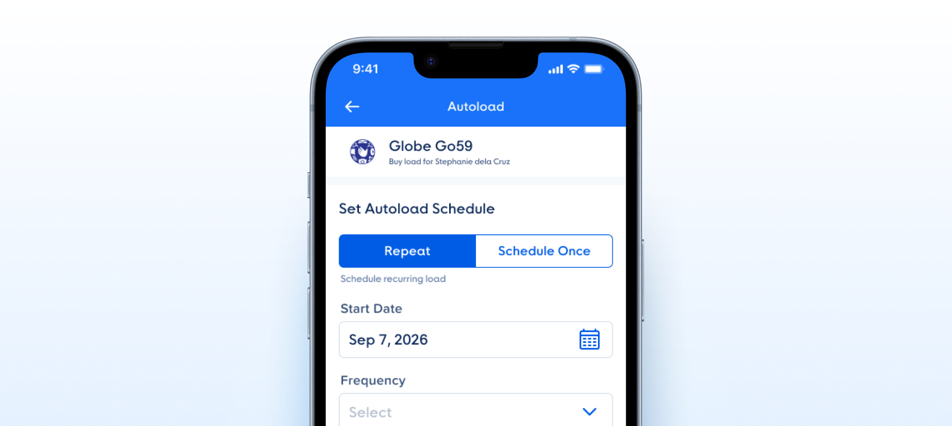
State × isActive, including pressed-active, with token-bound fills and a token-bound outline on inactive segments.How the segmented control button appears in a real product screen — the two segments Repeat (active) and Schedule Once under Set Autoload Schedule.
isActive, lowercase booleans. Active segments fill brand-blue, inactive carry the brand-blue outline; the label is edited on the instance.| State | iOS | Android | Figma Property | Notes |
|---|---|---|---|---|
| Active | Yes | Yes | Active=true | Fills brand-blue #005CE5 with a white label. The currently-selected segment. |
| Inactive | Yes | Yes | Active=false | White fill with a 1.5px brand-blue outline and a brand-blue label. |
| Pressed | Yes | Yes | State=Pressed | Touch-down feedback — active darkens to #2340A9; inactive shows a light #F6F9FD (72%) fill under the outline. |
| Disabled | Yes | Yes | State=Disabled | Muted #9BC5FD for both active fill and inactive outline; tap blocked. |
- v1.0:
Activeboolean moved to lowercasetrue/false(fromYes/No), matching the DS boolean standard. (C2) - v1.0:
State=Pressed, Active=truevariant added — the matrix is now the complete 3 × 2 = 6, so an already-active segment has a pressed treatment too (#2340A9). (C5) - v1.0: Segment label node renamed from
#valuetolabel. (C2) - Label is a text layer, not a text property: withdrawn — the label is set by overriding the text on the instance, which Figma allows without a property; owner decision, 6 Oct 2026, node 26628:50752 (C4)
- Normalize the
Activeboolean totrue/false. v1.0: Applied — lowercase, matching the DS standard. Rename - Complete the State × Active matrix. v1.0: Applied — added the missing pressed-active variant; the atom now ships all six combinations. State
Component Playground
Layout
VStack
Typography
Colors
iOS — Swift Package Manager
.package(url: "https://github.com/AY-Org/eb-ds-ios", from: "1.0.0")
Android — Gradle (Kotlin DSL)
implementation("com.eastblue.ds:toggle:1.0.0")
Import
import EastBlueDS
import com.eastblue.ds.toggle.*
The segment is composed by the parent Segmented Control; neither property is set directly. isActive forwards from the row’s selected index and State derives at runtime, so both are outputs of the row rather than inputs to the segment.
| Figma Property | SwiftUI | Compose |
|---|---|---|
| State — Default, Pressed, Disabled | derived — isPressed from the gesture, isEnabled from the environment | derived — interactionSource for pressed, enabled for disabled |
| isActive — true, false | isSelected: Bool — forwarded from the row’s selectedIndex | selected: Boolean — forwarded from the row’s selectedIndex |
| label — a TEXT layer, not a confirmed text property | Segment.label: String | Segment.label: String |
// The segment is never constructed directly. The row makes one per
// entry; isActive is index == selectedIndex.
EBSegmentedControl(
    segments: ["Label", "Label", "Label"],
    selectedIndex: $selected
)// The segment is never constructed directly. The row makes one per
// entry; isActive is index == selectedIndex.
EBSegmentedControl(
segments = listOf("Label", "Label", "Label"),
selectedIndex = selected
)// State=Disabled comes from the row, not per segment —
// every segment mutes together.
EBSegmentedControl(segments: segments, selectedIndex: $selected)
.disabled(true)
// State=Pressed is the touch-down frame. Nothing to set:
// the active segment darkens to #2340A9, an inactive one takes
// a #F6F9FD 72% wash under its label.// State=Disabled comes from the row, not per segment —
// every segment mutes together.
EBSegmentedControl(
segments = segments,
selectedIndex = selected,
enabled = false
)
// State=Pressed is the touch-down frame, read from
// interactionSource.collectIsPressedAsState().| Requirement | iOS | Android |
|---|---|---|
| Role | Each segment is a .button with .isSelected on the active one. | Apply Role.RadioButton per segment inside the row’s Modifier.selectableGroup(). |
| Selection announcement | Announce position in the set — "Label, selected, 1 of 3" — so the user knows how many segments there are. | Set stateDescription and let selectableGroup() supply the index. |
| Minimum target | The segment is 40.33pt tall — under the 44 × 44pt minimum. Extend with .contentShape rather than resizing; the drawn height belongs to the row. | Under the 48 × 48dp minimum. Use Modifier.minimumInteractiveComponentSize(), which pads the target without changing the drawn height. |
| Disabled | Not focusable; .disabled(true) comes from the parent control, so the whole row leaves the focus order together. | enabled = false on the row; not focusable. |
| Colour is not the only cue | Active versus inactive is carried by fill and label colour alone — no icon, no weight change. Pair the control with a heading that names what is being switched. | Same. The right-edge divider is decorative and must not be announced. |
| Dynamic Type / font scaling | The label is 16pt and must scale; the 40.33pt segment has to grow with it rather than clip. | Use sp for the label and let the segment height follow fontScale. |
Do
Let the parent <code>Segmented Control</code> own selection. <code>isActive</code> is <code>index == selectedIndex</code>, and <code>State</code> derives from the gesture and the enabled flag.
Don't
Don’t place a segment on its own or drive <code>isActive</code> per instance — two active segments in one row is a state the component cannot express.
Do
Treat the right-edge line as a divider between segments. It only renders on inactive segments, which is why it earns its place in a 3- or 4-segment control.
Don't
Don’t read it as a border. The stroke is declared on all four sides but only the right one has weight, so an inactive segment is not outlined — it is separated.
Do
Keep labels short enough to fit at the row’s widest segment. The segment is 16px padding either side of the label and every segment shares the row’s width equally.
Don't
Don’t rely on truncation. The label has no wrap or ellipsis treatment in any of the six variants, so an over-long label pushes the row past its container.
Do
Disable the whole row when the choice is unavailable — <code>State=Disabled</code> mutes active and inactive alike, to <code>#9BC5FD</code>.
Don't
Don’t disable a single segment to show it is unavailable. There is no per-segment disabled path, and a muted segment beside live ones reads as selected-but-faded.
| ID | Criterion | Status | Notes |
|---|---|---|---|
| C1 | Layer Structure & Naming | Ready | Each variant is a frame with a single label text layer. The inactive outline is a right-side stroke — 1px right, 0 on the other sides — which is how Figma stores a one-sided border. |
| C2 | Variant & Property Naming | Ready | State is PascalCase with Title Case values; isActive takes the is prefix with lowercase true/false. The property was Active in the retired 2026 Working File node and now matches the C2 boolean convention. |
| C3 | Token Coverage | Ready | Every value is token-bound: fills bg/color-bg-primary (+ hover, disabled) and bg/color-bg-overlay-light-strong, strokes border/color-border-primary (+ disabled), label colours text/color-text-*, padding space/space-12 / space-16, text style Primary/Label/Base. |
| C4 | Native Mappability | Ready | Maps cleanly: isActive forwards from the row’s selected index, State derives from the press gesture and the enabled flag, and the label is a plain string set on the instance. |
| C5 | Interaction State Coverage | Ready | Complete 3 × 2 matrix with no gaps — Default, Pressed and Disabled at both isActive values, including the pressed-active frame that the 1.0.0 assessment added. |
| C6 | Asset & Icon Quality | Not Applicable | Text-only segment. No icons, no images, nothing to vectorise. |
State (3) × isActive (2) = 6. Complete matrix, no gaps. Active segments are a solid fill with a white label; inactive ones have no fill — bar Pressed — and carry a right-edge divider in the state’s own colour.
| State | isActive | Node ID | Background | Divider | Label |
|---|---|---|---|---|---|
| Default | true | 26628:50753 | #005CE5 | – | #FFFFFF |
| Pressed | true | 26628:50755 | #2340A9 | – | #FFFFFF |
| Disabled | true | 26628:50757 | #9BC5FD | – | #FFFFFF |
| Default | false | 26628:50759 | – | #005CE5 | #005CE5 |
| Pressed | false | 26628:50761 | #F6F9FD @ 72% | #005CE5 | #2340A9 |
| Disabled | false | 26628:50763 | – | #9BC5FD | #9BC5FD |
meta.node pointed at 4111:10773 in the 2026 Working File (pbxY8a2xcIfVZKxwnud9Xe); the live component is 26628:50752 in Sticker Sheets v2 (HwWDwPit2xJjDH4zszOZ5o). Every value in this entry is re-read from the latter. Dated when found — nothing records when the move happened.export_node_as_image shows a single vertical line on the right edge only — the stroke is declared on all four sides and just the right one has weight. The component is a segment divider, not a bordered button.Active renamed isActive. The property now takes the is prefix with lowercase true/false, matching the C2 boolean convention and its siblings in the Radio family.#2340A9 and disabled-inactive is #9BC5FD — both now recorded, so all six variants have a label value.#F6F9FD; the fill is #F6F9FD at 0.72.Primary/Label/Base, matched. Replaces the font spec Proxima Soft Bold · 16 / 16 · +0.25, which the guide bans as a stand-in for a style name.demoControls: [] and a hand-written inline-styled span for a preview. It now has public/scripts/demos/segmented-control-button.js with State and isActive controls, and the preview and the server-rendered markup come from one renderer.4111:* / 4715:* nodes from the retired file, replaced with 26628:50753–26628:50763, each carrying its verified background, divider and label.Prop=Value form and is now one prose row per property.container / label; each variant has a single label TEXT child and no container frame. C2 said Active was "retained by design" — it was renamed.strokeWeight, and the outside-aligned stroke falls outside the SVG export bounds, so get_svg drops it entirely. The preview draws 1px — the one value in the Style tab that is not attested.label is an exposed text property is unverified. The layer is named label, not #label, and the property panel was not supplied. If it is not exposed, segment text cannot be set in Figma at all — a gap rather than a documentation issue.—. No segmented-control/* namespace is registered; the previous record’s paths were not carried forward because they named the retired file.meta.node, meta.figmaUrl, the description, the verdict and the Behavior table all name 4111:10773, Active, and the 1.5px outline. Overview scope — needs a Component Review run before the page stops contradicting itself.State × Active. DocumentedYes/No → true/false, matching the DS standard. Resolved#2340A9). Resolved#value → label. Resolved