Stacked or overlapping avatars used to show participant lists — conversation members, shared documents, collaboration indicators.
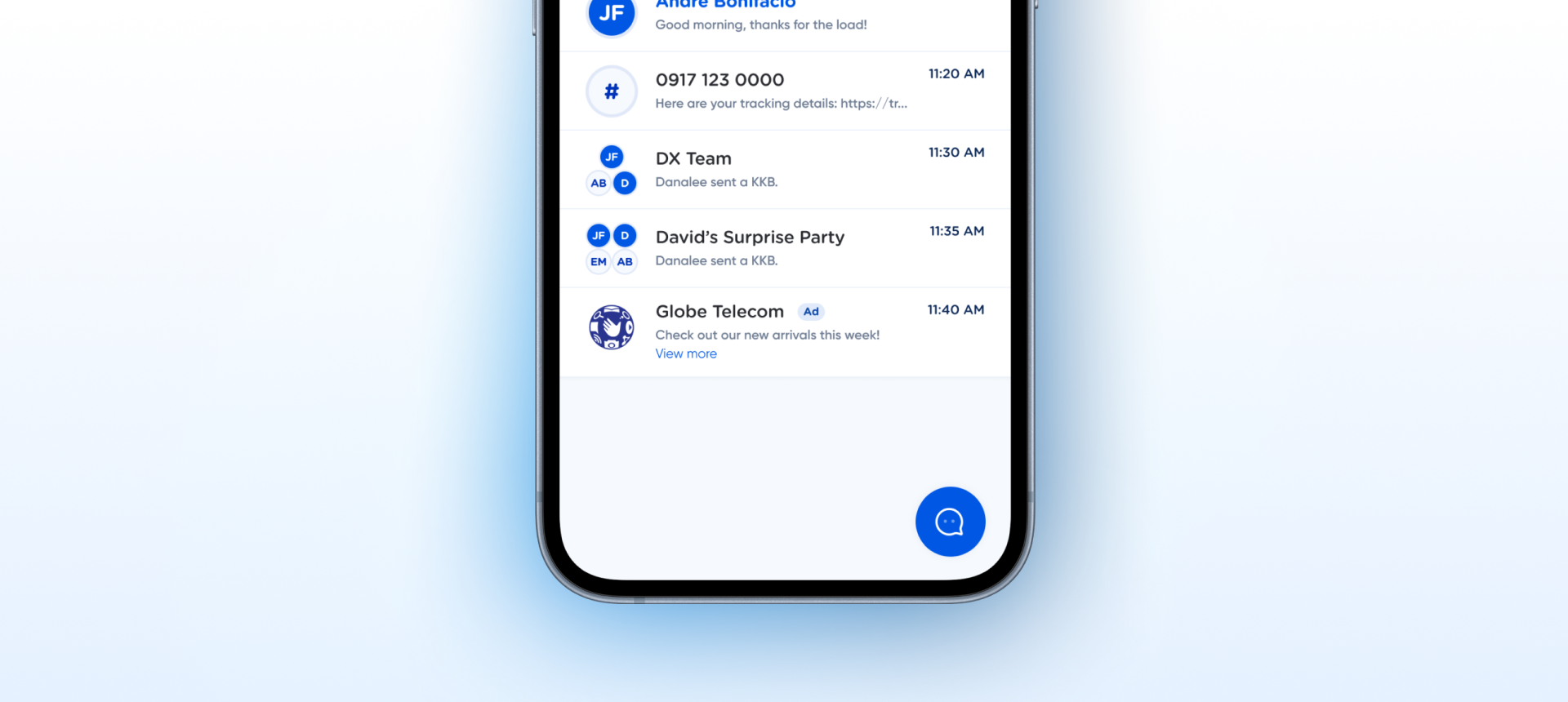
layout with semantic values ✓. Overflow variant added ✓. Inner avatars repointed to canonical Avatar via instance swap ✓. Only C7 (Code Connect) remains — tracked universally across all components.How the avatar group appears in a real product screen — conversation list where grouped chats display stacked avatars (DX Team, David's Surprise Party) alongside single-avatar threads.
no. of initals → layout with semantic values (pair/trio/quad/overflow). C2 resolved. Inherits the main/avatar/brand/intials typo from Avatar's shared variable collection (tracked under Avatar, not an Avatar Group blocker).17143:4488). Changes to Avatar now propagate to Avatar Group automatically. Compositional inheritance restored.| State | iOS | Android | Figma Property | Notes |
|---|---|---|---|---|
| 2 avatars | Yes | Yes | layout=pair | Diagonal overlap — top-left + bottom-right |
| 3 avatars | Yes | Yes | layout=trio | Triangle arrangement |
| 4 avatars | Yes | Yes | layout=quad | 2×2 grid |
| Overflow (5+) | Yes | Yes | layout=overflow | 3 avatars + "+N" badge in bottom-right slot. Uses the same default/light style as the avatar it replaces. |
| Pressed / Disabled | N/A | N/A | — | Display-only. Tap behavior handled by parent container. |
- Property renamed:
no. of initals→layoutwith semantic values (pair/trio/quad/overflow). Fixes typo, removes spaces/dots, replaces pseudo-numeric strings with true enum values. Maps cleanly to SwiftUIEBAvatarGroupLayout.pair/.trio/.quad/.overflow/ ComposeEBAvatarGroupLayout.Pairetc. C2 Fixed - Overflow variant
layout=overflowadded — bottom-right slot shows "+N" badge instead of a 4th avatar. Handles groups larger than 4. C5 Fixed - Inner avatars repointed via instance swap to the canonical Avatar component (
17143:4488). Previously referenced a duplicate Avatar at21:94766— now all 4 variants inherit from the canonical source. Compositional pattern restored: changes to Avatar will propagate here automatically. C6 Fixed
- Code Connect mappings not registered. Structural work (count → layout rename, overflow variant, instance swap to canonical Avatar) is complete — registration can proceed. C7 · Code Connect Linkability
- Add size variants. Current 48×48 container is fixed — bigger groups (5+ avatars) benefit from a larger container for readability. Propose
groupSize = small | medium | largewith appropriate inner avatar sizes. Property - Deprecate the duplicate Avatar at
21:94766. Now that Avatar Group points at the canonical17143:4488, the duplicate should be marked deprecated and removed in a future DS cleanup pass. Family
Two avatars placed diagonally. Top-left uses dark-initials (brand), bottom-right uses initials-light (default).
Inner avatars use the same tokens as the main Avatar component. See Avatar / Style tab for the full token reference.
| Role | Token | Value |
|---|---|---|
| Brand avatar bg | main/avatar/brand/bg | #005CE5 |
| Brand avatar border | main/avatar/brand/border | #E5EBF4 |
| Brand avatar initials | main/avatar/brand/intials library typo | #FFFFFF |
| Default avatar bg | main/avatar/default/bg | #F6F9FD |
| Default avatar border | main/avatar/default/border | #E5EBF4 |
| Default avatar initials | main/avatar/default/initials | #2340A9 |
Three avatars in a triangular arrangement. Two on top (dark + dark), one default at bottom.
| Role | Token |
|---|---|
| Container size | 48 × 48 |
| Inner avatar size | 24 × 24 |
| Inner avatar radius | 12px |
| Inner avatar border | 1.5px solid |
| Overlap offset (2 avatars) | 16px diagonal |
| Overlap offset (3 avatars) | 12px horizontal, 24px vertical |
| Overlap offset (4 avatars) | 24px grid step |
Four avatars in a 2×2 grid. Top row: brand + brand. Bottom row: default + default.
Overflow variant — 3 avatars plus a "+N" badge in the bottom-right position. Use when group has 5 or more members. The "+N" uses the default/light avatar style with overridable text content.
iOS — Swift Package Manager
// In Xcode: File → Add Package Dependencies
"https://github.com/AY-Org/eb-ds-ios"
Android — Gradle (Kotlin DSL)
dependencies {
    implementation("com.eastblue.ds:avatar:1.0.0")
}
| Figma Property | SwiftUI | Compose |
|---|---|---|
| layout=pair | .ebLayout(.pair) | layout = EBAvatarGroupLayout.Pair |
| layout=trio | .ebLayout(.trio) | layout = EBAvatarGroupLayout.Trio |
| layout=quad | .ebLayout(.quad) | layout = EBAvatarGroupLayout.Quad |
| layout=overflow | .ebLayout(.overflow) | layout = EBAvatarGroupLayout.Overflow |
// Pair / trio / quad — pass avatars, layout auto-detected from count
EBAvatarGroup(avatars: [
    EBAvatar(initials: "DM"),
    EBAvatar(initials: "LM"),
    EBAvatar(initials: "AB")
])

// Overflow — pass full list + max visible count
EBAvatarGroup(avatars: allAvatars, maxVisible: 3)
    .ebLayout(.overflow)
    // renders 3 avatars + "+N" if allAvatars.count > 3
// Pair / trio / quad — pass avatars, layout auto-detected from count
EBAvatarGroup(
    avatars = listOf(
        Avatar(initials = "DM"),
        Avatar(initials = "LM"),
        Avatar(initials = "AB")
    )
)

// Overflow — pass full list + maxVisible
EBAvatarGroup(
    avatars = allAvatars,
    maxVisible = 3,
    layout = EBAvatarGroupLayout.Overflow
)
| Requirement | iOS | Android |
|---|---|---|
| Accessibility label | .accessibilityLabel("3 participants: Dara, Lara, Alex") | contentDescription = "3 participants: ..." |
| Role | Decorative if not tappable — use .accessibilityHidden(true) on individual avatars | Same — prefer single group-level semantic |
| Tap target | 48 × 48 container meets iOS HIG when whole group is tappable | Meets Material 48dp minimum |
Do
Use Avatar Group for 2–4 participants in a list item, header, or shared-with indicator.
Don't
Use for counts above 4 without an overflow "+N" badge — users can't infer total count from a cluster alone.
Do
Provide a single group-level accessibility label listing all participants.
Don't
Let each avatar announce separately — creates VoiceOver/TalkBack noise.
| ID | Criterion | Status | Notes |
|---|---|---|---|
| C1 | Layer Structure & Naming | Ready | Semantic names: Avatar, container. Top-level component set uses "Avatar Group" — clean. |
| C2 | Variant & Property Naming | Requires Rework | Property no. of initals has typo, spaces, and uses string values. Rename to count with integer values. |
| C3 | Token Coverage | Ready | All colors bound to Avatar's tokens. Inherits the same typo in intials — tracked under Avatar's open issues. |
| C4 | Native Mappability | Needs Refinement | Maps to stacked avatars via ZStack (iOS) / Box + offset (Compose). Fixed 48×48 and count=2/3/4 don't match a dynamic native list — API should accept an array. |
| C5 | Interaction State Coverage | Requires Rework | No overflow state for 5+ avatars. Common DS pattern ("+N" badge) is missing. |
| C6 | Asset & Icon Quality | Needs Refinement | Inner avatars are hardcoded 24px containers, not Avatar component instances. Breaks compositional inheritance — changes to Avatar won't propagate. |
| C7 | Code Connect Linkability | Needs Refinement | No CLI mappings registered yet. |
| layout | Node ID | Size | Notes |
|---|---|---|---|
| pair | 18276:4555 | 48 × 48 | 2 avatars — diagonal |
| trio | 18276:4558 | 48 × 48 | 3 avatars — triangle |
| quad | 18276:4562 | 48 × 48 | 4 avatars — 2×2 grid |
| overflow | 18276:4585 | 48 × 48 | 3 avatars + "+N" overflow badge |
no. of initals → layout. Values changed from pseudo-numeric strings (2/3/4/5+) to semantic enum values (pair/trio/quad/overflow). Fixes typo, spaces, and dots in one pass. Clean native enum mapping.
Fixedlayout=overflow displays 3 avatars + a "+N" badge in the 4th slot. Handles groups larger than 4.
Added21:94766. All 4 variants now use instances of the canonical Avatar at 17143:4488. Compositional inheritance restored.
Swappedno. of initals → layout. Values changed from pseudo-numeric strings (2/3/4/5+) to semantic enum values (pair/trio/quad/overflow). Fixes typo, spaces, and dots in one pass. Clean native enum mapping.
Fixedlayout=overflow displays 3 avatars + a "+N" badge in the 4th slot. Handles groups larger than 4.
Added21:94766. All 4 variants now use instances of the canonical Avatar at 17143:4488. Compositional inheritance restored.
Swappedno. of initals: missing second "i", contains dot + space. Values are strings instead of integers. Blocks native enum mapping.
Fixed in 1.1.0