A circular display element showing user initials or a profile image. Supports 7 sizes (20px-90px) and 3 types (dark initials, light initials, image). Used when a profile image is unavailable or for visual user identification.
How the avatar appears in a real product screen — Contacts list with Favorites row (brand fill + default fill avatars in circular display).
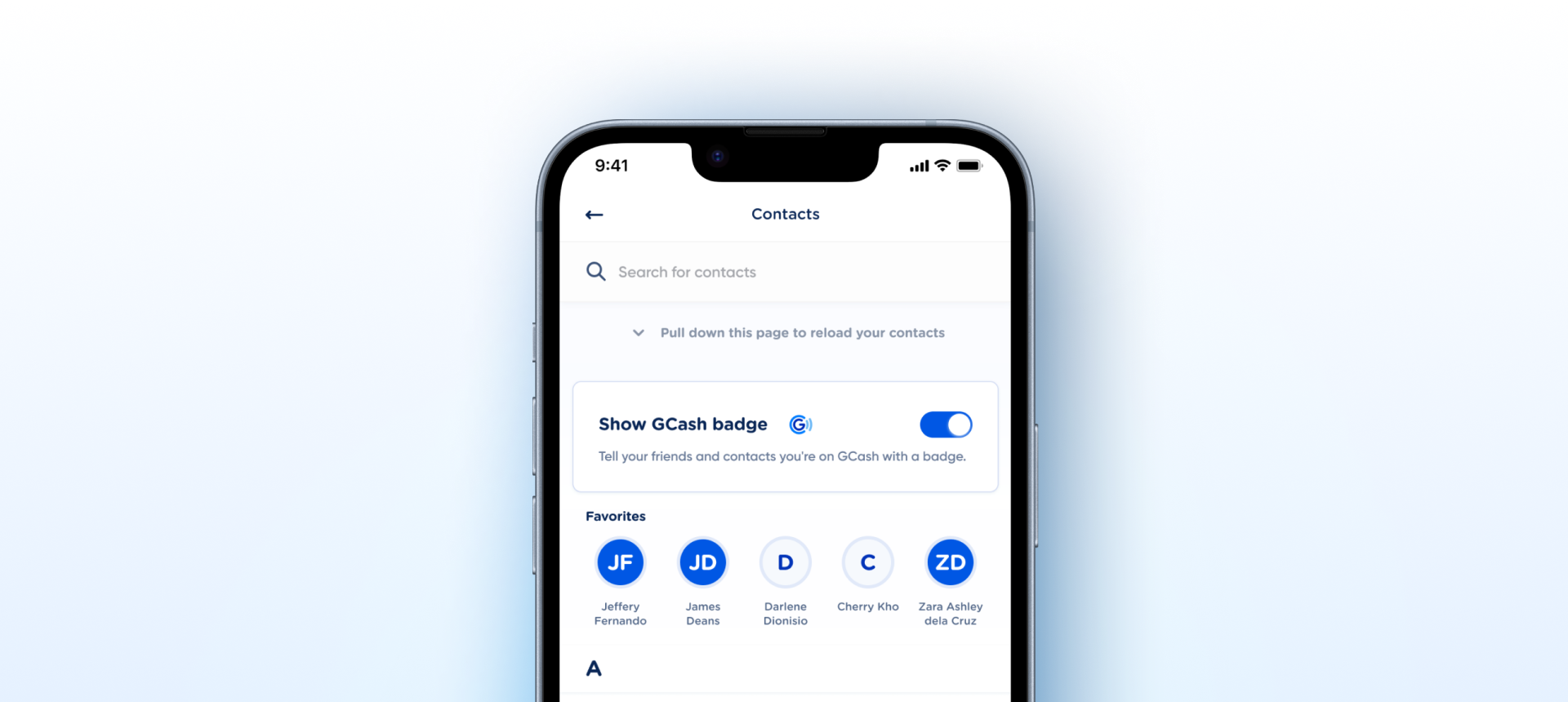
main/avatar/...). Variant naming verified correct (type=initials-light). Border-radius tokenized to radius/radius-round. One C2 issue remaining: token main/avatar/brand/intials has typo (should be initials) — manual rename needed in Figma Variables panel.| State | iOS | Android | Figma Property | Notes |
|---|---|---|---|---|
| Default | Yes | Yes | type + size | Display-only. All 3 types fully defined across 7 sizes. |
| Pressed | N/A | N/A | -- | Display-only component. Tap behavior handled by parent container. |
| Disabled | N/A | N/A | -- | Display-only component. No disabled state. |
| Focused (a11y) | N/A | N/A | -- | Display-only. Focus rings rendered by parent interactive container if needed. |
- Border-radius: bound to
radius/radius-round(99999) across all sizes — previously hardcoded per size (C3) - Border-width: confirmed fixed per size by design — not a token gap (C3)
- Raster backgrounds replaced with vector ELLIPSE layers across all 5 affected initials variants (C6)
- Avatar Group compound component created (previously a design recommendation) — see sibling component under Avatar group (C2)
- Variant property value naming verified on recheck: variant names are correctly hyphenated as
type=initials-lightin Figma source. Earlier "spaces" report was an MCP output artifact (TypeScript enum generation converts hyphens to spaces). No action required. C2 Verified
- Code Connect mappings not registered. Structural issues are resolved — registration can proceed against the current
type×shape×sizeschema. C7 · Code Connect Linkability
- Add a status
badgeoverlay slot. Common in chat, contacts, and profile lists — online/offline dots, notification counts, verified checkmarks. Today consumers stack a Badge manually on top of Avatar; a built-in slot encodes the correct offset and sizing. Slot
Blue circle with white initials text. Branded avatar used as default when no photo is available.
Display-only component. No interaction states. All colors bound to main/avatar/brand/ tokens.
| Role | Token | Value |
|---|---|---|
| Circle bg | main/avatar/brand/bg | #005CE5 |
| Circle border | main/avatar/brand/border | #E5EBF4 |
| Initials text | main/avatar/brand/initials | #FFFFFF |
Light circle with blue initials text. Neutral variant for non-branded contexts.
Display-only component. No interaction states. All colors bound to main/avatar/default/ tokens.
| Role | Token | Value |
|---|---|---|
| Circle bg | main/avatar/default/bg | #F6F9FD |
| Circle border | main/avatar/default/border | #E5EBF4 |
| Initials text | main/avatar/default/initials | #2340A9 |
User profile photo in a circle clip. Falls back to placeholder when image fails to load.
Display-only component. Placeholder colors shown when image has not loaded. All colors bound to main/avatar/placeholder/ tokens.
| Role | Token | Value |
|---|---|---|
| Placeholder bg | main/avatar/placeholder/bg | #C2CFE5 |
| Placeholder border | main/avatar/placeholder/border | #E5EBF4 |
iOS -- Swift Package Manager
// In Xcode: File -> Add Package Dependencies
"https://github.com/AY-Org/eb-ds-ios"

// Or in Package.swift:
.package(
    url: "https://github.com/AY-Org/eb-ds-ios",
    from: "1.0.0"
)
Android -- Gradle (Kotlin DSL)
// build.gradle.kts (app)
dependencies {
    implementation("com.eastblue.ds:avatar:1.0.0")
}
Import
import EastBlueDS  // SwiftUI
import com.eastblue.ds.avatar.*  // Compose
Package not yet published. These are the planned distribution paths. API shape is final -- native implementation is pending.
Every row maps a Figma component property to its native equivalent.
| Figma Property | SwiftUI | Compose |
|---|---|---|
type=dark-initials | .darkInitials | AvatarType.DarkInitials |
type=initials-light | .lightInitials | AvatarType.LightInitials |
type=image | .image(url:) | AvatarType.Image(url) |
size=20px...90px | size: AvatarSize | size: AvatarSize |
// Dark initials
EBAvatar("DM", type: .darkInitials, size: .large)
// Dark initials
EBAvatar(
    initials = "DM",
    type = AvatarType.DarkInitials,
    size = AvatarSize.Large
)
// Light initials
EBAvatar("LM", type: .lightInitials, size: .medium)
// Light initials
EBAvatar(
    initials = "LM",
    type = AvatarType.LightInitials,
    size = AvatarSize.Medium
)
// Image
EBAvatar(imageURL: profileURL, size: .large)
// Image
EBAvatar(
    imageUrl = profileUrl,
    type = AvatarType.Image,
    size = AvatarSize.Large
)
| Requirement | iOS | Android |
|---|---|---|
| Alt text | accessibilityLabel("User avatar") | contentDescription = "User avatar" |
| Decorative mode | isAccessibilityElement = false (in lists) | importantForAccessibility = no |
| Image loading | AsyncImage with placeholder | SubcomposeAsyncImage with placeholder |
Do
Use dark-initials as default when no photo is available.
Don't
Use image type with placeholder -- use initials instead.
Do
Match avatar size to context (20px in dense lists, 90px in profiles).
Don't
Mix initials types in the same context.
Do
Always pass 2-letter initials (first + last).
Don't
Show single-letter or empty initials.
Do
Provide alt text for image avatars.
Don't
Skip accessibility labels.
| ID | Criterion | Status | Notes |
|---|---|---|---|
| C1 | Layer Structure & Naming | Ready | Layers named container, background, replace here - image. Simple hierarchy. Minor: some sizes have a child also named container. |
| C2 | Variant & Property Naming | Ready | Variant naming resolved (initials-light). Token name typo fixed (main/avatar/brand/initials). Size values use px suffix (minor, no impact on native mapping). |
| C3 | Token Coverage | Needs Refinement | 8 color tokens, full typography tokens, and radius/radius-round connected. Border-width is fixed per size (by design). |
| C4 | Native Mappability | Ready | Maps to custom Circle-clipped view on both platforms. No web-only patterns. |
| C5 | Interaction State Coverage | Not Applicable | Display-only component. No interactive states needed. |
| C6 | Asset & Icon Quality | Ready | All initials variants now use vector ELLIPSE layers. Image type rasters are expected (user photos). |
| C7 | Code Connect Linkability | Needs Refinement | Usage descriptions attached. Variant naming now clean. Token typo remains. No CLI mappings. |
3 type × 7 size = 21 variants. No interaction state axis (display-only component).
| Type | Sizes | Notes | Count |
|---|---|---|---|
| dark-initials | 20, 24, 32, 40, 48, 64, 90 px | Brand background, white initials | 7 |
| initials-light | 20, 24, 32, 40, 48, 64, 90 px | Light background, dark initials | 7 |
| image | 20, 24, 32, 40, 48, 64, 90 px | Photo fill (raster expected) | 7 |
type=initials - light renamed to type=initials-light across all 7 variants. Now matches dark-initials hyphen style.
Fixedmain/avatar/brand/intials corrected to main/avatar/brand/initials. Token now maps correctly to native implementations.
Fixedradius/radius-round (99999) instead of hardcoded per-size values (45.213px, 24px, 16px, 12px, 10px).
Fixed