A disclosure row that expands to reveal content. Supports optional leading icon and description via boolean visibility properties. Reduced from 24 to 6 variants (Type × State) with color tokens fully connected.
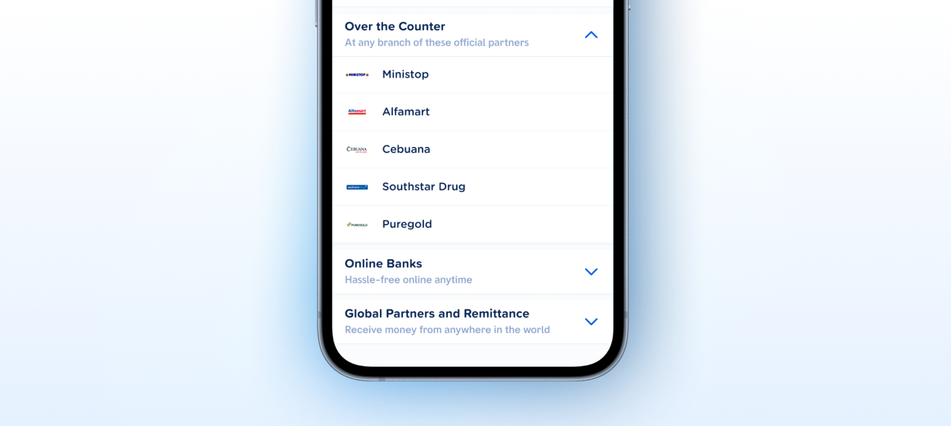
How the accordion appears in a real product screen — expanding to reveal content.
content-body slot. Boolean visibility on leadingIcon and description lets designers configure the component without extra variants.content-body panel are both included. Engineers can implement it as a standalone unit with no external spec needed.Type) drives collapsed/expanded. leadingIcon and description are boolean show/hide properties — no duplicate variants needed.icon-leading, content, trailing-icon). Chevrons are vector instances. The icon slot accepts instances cleanly.| State | iOS | Android | Figma Property | Notes |
|---|---|---|---|---|
| Default | Yes | Yes | State=Default | Header row with chevron. Tap to expand/collapse. |
| Pressed | Yes | Yes | State=Pressed | Visual feedback on touch. Darker surface token. |
| Disabled | Yes | Yes | State=Disabled | Muted colors. Tap ignored. Chevron dimmed. |
| Focused (a11y) | N/A | N/A | — | Mobile OS handles focus rings natively. |
- Boolean properties converted from yes/no to true/false (C2)
- Layer names corrected to semantic naming:
container,icon-leading,content,trailing-icon(C1) - Pressed and disabled interaction states added across all 6 variants (C5)
- Expanded content panel with
content-bodySLOT added to all expanded variants (C4) - Variant set reduced from 24 to 6 —
Type×Statematrix (C2) -
leadingIconanddescriptionconverted to boolean visibility properties - Fixed 56px header height applied across all 6 variants
- 10 design tokens connected — all colors, spacing, and typography fully tokenized (C3)
- Annotation instance frame built with nested auto layout (Type × State grid)
- Code Connect mappings not registered. No native component files are linked yet. All structural blockers are resolved — registration can now proceed. C7 · Code Connect Linkability
- Add an
AccordionGroupcompound component. Manages exclusive expand (only one open at a time) — the canonical FAQ and settings pattern. Avoids every consumer wiring their own expanded-id state. Family
Header row only — 56px fixed height. Trailing chevron points down. Tap anywhere in the row to expand.
All colors are bound to design tokens from the component variable collection.
| Role | Token | Default | Pressed | Disabled |
|---|---|---|---|---|
| Header bg | surface/default | #FFFFFF | — | — |
| Pressed bg | surface/pressed | — | #F4F7FB | — |
| Disabled bg | surface/disabled | — | — | #F8F9FB |
| Border | border/subtle | #E5EBF4 | #E5EBF4 | #E5EBF4 |
| Label | text/primary | #0A2757 | #0A2757 | — |
| Label (disabled) | text/disabled | — | — | #C2C6CF |
| Description | text/secondary | #90A8D0 | #90A8D0 | — |
| Icon placeholder | icon/placeholder | #C2C6CF | #C2C6CF | #C2C6CF |
| Chevron | icon-chevron | #005CE5 | #005CE5 | #C2CFE5 |
Header row (56px) + content-body panel (56px SLOT) = 112px total height. Trailing chevron points up. Content-body background uses <code>surface/content</code> token.
Expanded adds the surface/content token for the content-body panel background.
| Role | Token | Default | Pressed | Disabled |
|---|---|---|---|---|
| Header bg | surface/default | #FFFFFF | — | — |
| Pressed bg | surface/pressed | — | #F4F7FB | — |
| Disabled bg | surface/disabled | — | — | #F8F9FB |
| Content bg | surface/content | #F4F7FB | #F4F7FB | #F8F9FB |
| Border | border/subtle | #E5EBF4 | #E5EBF4 | #E5EBF4 |
| Label | text/primary | #0A2757 | #0A2757 | — |
| Label (disabled) | text/disabled | — | — | #C2C6CF |
| Description | text/secondary | #90A8D0 | #90A8D0 | — |
| Icon placeholder | icon/placeholder | #C2C6CF | #C2C6CF | #C2C6CF |
| Chevron | icon-chevron | #005CE5 | #005CE5 | #C2CFE5 |
iOS — Swift Package Manager
// In Xcode: File → Add Package Dependencies
"https://github.com/AY-Org/eb-ds-ios"

// Or in Package.swift:
.package(
    url: "https://github.com/AY-Org/eb-ds-ios",
    from: "1.0.0"
)
Android — Gradle (Kotlin DSL)
// build.gradle.kts (app)
dependencies {
    implementation("com.eastblue.ds:accordion:1.0.0")
}
Import
import EastBlueDS  // SwiftUI
import com.eastblue.ds.accordion.*  // Compose
Package not yet published. These are the planned distribution paths. API shape is final — native implementation is pending.
Every row maps a Figma component property to its native equivalent.
| Figma Property | SwiftUI | Compose |
|---|---|---|
Type=Collapsed | isExpanded: false | isExpanded = false |
Type=Expanded | isExpanded: true | isExpanded = true |
State=Disabled | .disabled(true) | enabled = false |
leadingIcon=true | leadingIcon: Image? | leadingIcon: @Composable (() -> Unit)? |
description=true | description: String? | description: String? |
Content-Body (SLOT) | content: () -> some View | content: @Composable () -> Unit |
// Basic
EBAccordion("Settings", isExpanded: $isExpanded) {
    Text("Content goes here")
}

// With leading icon
EBAccordion("Settings",
    isExpanded: $isExpanded,
    leadingIcon: Image(systemName: "gear")
) {
    Text("Content")
}

// With description
EBAccordion("Settings",
    description: "Manage your preferences",
    isExpanded: $isExpanded
) {
    Text("Content")
}

// Disabled
EBAccordion("Settings", isExpanded: $isExpanded) {
    Text("Content")
}
.disabled(true)
// Basic
EBAccordion(
    title = "Settings",
    isExpanded = isExpanded,
    onExpandedChange = { isExpanded = it }
) {
    Text("Content goes here")
}

// With leading icon
EBAccordion(
    title = "Settings",
    isExpanded = isExpanded,
    onExpandedChange = { isExpanded = it },
    leadingIcon = { Icon(Icons.Filled.Settings, null) }
) {
    Text("Content")
}

// Disabled
EBAccordion(
    title = "Settings",
    isExpanded = isExpanded,
    onExpandedChange = {},
    enabled = false
) {
    Text("Content")
}
| Requirement | iOS | Android |
|---|---|---|
| Min touch target | 44 × 44pt (full header row) | 48 × 48dp (full header row) |
| Expand/collapse | .accessibilityAction(.default) toggles | onClick handler on header |
| State announcement | .accessibilityValue("expanded"/"collapsed") | expandedState semantics |
| Disabled | .disabled(true) — announced by VoiceOver | enabled = false |
| Content-body | Automatically read by screen reader when expanded | Automatically read by screen reader when expanded |
| Chevron icon | .accessibilityHidden(true) — decorative | contentDescription = null — decorative |
Do
Use Accordion for progressive disclosure — hiding secondary content until the user needs it.
Don't
Nest Accordions more than one level deep — it creates confusing navigation.
Do
Use description text for context that helps users decide whether to expand.
Don't
Put critical information inside collapsed Accordions — users may miss it.
Do
Use leadingIcon to reinforce the section's topic — gears for settings, bell for notifications.
Don't
Use Accordion for content the user needs to compare side-by-side — use tabs instead.
| ID | Criterion | Status | Notes |
|---|---|---|---|
| C1 | Layer Structure & Naming | Ready | Semantic names across all variants: container, icon-leading, content, trailing-icon. |
| C2 | Variant & Property Naming | Ready | Boolean properties use true/false. Variant keys use key=value syntax. leadingIcon and description are boolean visibility props. |
| C3 | Token Coverage | Ready | 10 tokens bound across all 6 variants. All colors, spacing, and typography fully tokenized. |
| C4 | Native Mappability | Ready | Header + content-body SLOT maps cleanly to DisclosureGroup (SwiftUI) and AnimatedVisibility (Compose). |
| C5 | Interaction State Coverage | Ready | Default, pressed, and disabled states covered across all 6 variants. Focus ring N/A — mobile OS handles natively. |
| C6 | Asset & Icon Quality | Ready | Chevrons are vector component instances. Leading icon is a SLOT placeholder accepting any icon instance. |
| C7 | Code Connect Linkability | Needs Refinement | No Code Connect mappings registered. Property structure is clean and ready for mapping — suggested paths below. |
| Aspect | Status | Notes |
|---|---|---|
| Component type | Ready | Proper Figma component set. |
| Variant naming | Ready | key=value syntax with true/false booleans. |
| Property naming | Ready | Clean 1:1 mapping to native params. |
| Layer naming | Ready | container, icon-leading, content, trailing-icon. |
| Token coverage | Ready | All 10 tokens bound — colors, spacing, and typography. |
| Asset quality | Ready | Chevrons are vector component instances. Icon slot is SLOT type. |
| Code Connect | Not Mapped | No mappings registered. Suggested paths below. |
2 Type values × 3 State values. leadingIcon and description are boolean visibility properties, not variant axes.
| Type | State | Node ID |
|---|---|---|
| Collapsed | Default | 16870:9289 |
| Expanded | Default | 16870:9298 |
| Collapsed | Pressed | 16919:864 |
| Expanded | Pressed | 16919:877 |
| Collapsed | Disabled | 16919:956 |
| Expanded | Disabled | 16919:969 |
Placeholder reverted after v1.3.0 restructure. Re-applied icon-leading name across all 6 current variants.
FixedHeyMeowRnd-Bold.ttf (700, TTF, GPOS kerning, 959 glyphs) and BarkAda-SemiBold.ttf (600, TTF, GPOS kerning, 1050 glyphs) confirmed native-ready. BarkAda uses PostScript name BarkAda-SemiBold for iOS registration.
ValidatedleadingIcon and description converted from variant axes to boolean visibility properties. Component set now has 2 Type values (Collapsed / Expanded) × 3 State values (Default / Pressed / Disabled) = 6 variants total.
Refinedsurface/default, border/subtle, text/primary, text/secondary, icon/placeholder, icon-chevron, surface/pressed, surface/content, surface/disabled, text/disabled. Fully resolves C3.
FixedlabelDescription → description for cleaner 1:1 mapping to native params.
Refinedcontent-body frame (360×80px) added at y=62 inside each container. Background: #F4F7FB (surface/content token). Border: #E5EBF4. Fully resolves C4.
Fixedstate property added with values default / pressed / disabled. Fully resolves C5.
FixedFrame to container.
FixedPlaceholder to icon-leading.
Fixedleading icon and label description converted from yes/no to true/false. Fully resolves C2.
Fixedcontent-body frame added to all 12 expanded variants.
Fixed in 1.2.0